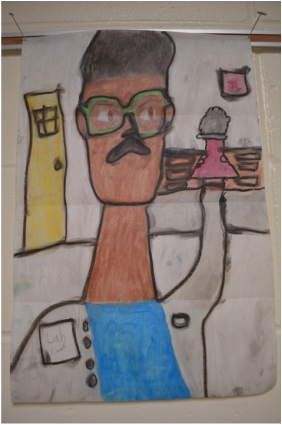
 This lesson focused on the artist Modigliani, Expressionism, and Proportions of the face. Students used 12"x18" 60# paper (but 80# would have been better...), oil pastels, and baby oil to create their own "oil paintings". First, I showed students some of Modigliani's artwork. A big question was, "Why did he make all his portraits have long necks?" This led into a discussion about expressionism and how not all art is realistic. Next, we talked about what a portrait is and how we draw correct proportions. I used Expressive Monkey's proportions handout to keep students on track. We folded out papers in half and then each side folded towards the middle. This made three folds. The top fold was the "eye" line. The middle fold was the "chin" line and the bottom line was the "shoulder" line. This made the necks long like Modigliani's.
Students were then asked to brainstorm what they wanted to do when they grow up. If students were stuck, I had them choose something they'd like to do when they grow up (like climb Mount Everest, play in the NBA, go skydiving, etc.) I had them draw three symbols that represented what they wanted to be or what they wanted to do. I modeled this for them by pretending I wanted to be a nurse. I drew a stethoscope, the red cross symbol, and a wheelchair. I told students that I wanted to be able to tell instantly what they wanted to be. Students spent two class periods drawing their self-portrait in pencil first. Then they started coloring in with oil pastel. I had small cups of baby oil spread out over each table. I made sure to only put a little bit in each cup to keep kids from using too much or spilling too much. Students used their fingers and q-tips to blend the baby oil and oil pastel together. Some students really didn't like the smell of baby oil while others had no complaints. We made sure to use newspaper below the portraits. As baby oil was added, the paper tended to turn transparent and there was baby oil everywhere. However, I noticed that after a month of these drying out in the hallway, that the oil seemed to evaporate. I used approximately 6 bottles of baby oil for 250 6th graders. It was more oil than I expected! I bought a pack of 500 q-tips at the Dollar Tree. I had a huge stash of old oil pastels that worked wonderfully though. The dried out oil pastels came right back to life when baby oil was added. I told students to use black last, as black is very tough to cover up and it gets smudges all over! Storing the portraits was a bit of a challenge. Some students used a bit too much oil, so their colors would rub off on other students' work. Next time I would monitor better how much oil the students used. As I stated before though, after a month of drying, they were much less oily. Overall this was a fun project and really helped me get to know my students better! Overall cost of the project was about $25 without the cost of paper for 250 6th graders. 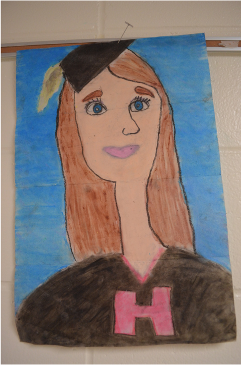 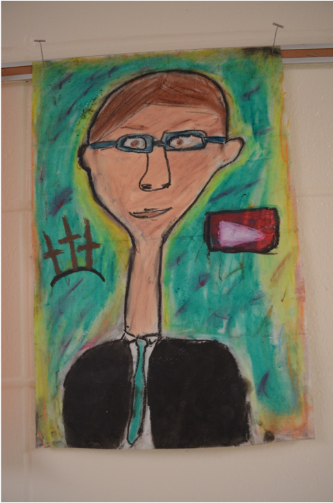 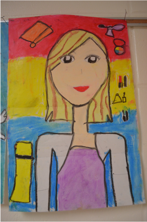
0 Comments
|
Mrs. QuamThis is my 11th year teaching art & graphic design! I have taught middle school for 2 years and high school for almost 5 years. I truly enjoy working with students on a daily basis. I also enjoy teaching real-world skills such as problem solving, using technology, and the power of teamwork and collaboration. My joy is sharing my passion for art with others! Archives
March 2024
Categories
All
|
||
 RSS Feed
Photo from Rob Qld
