|
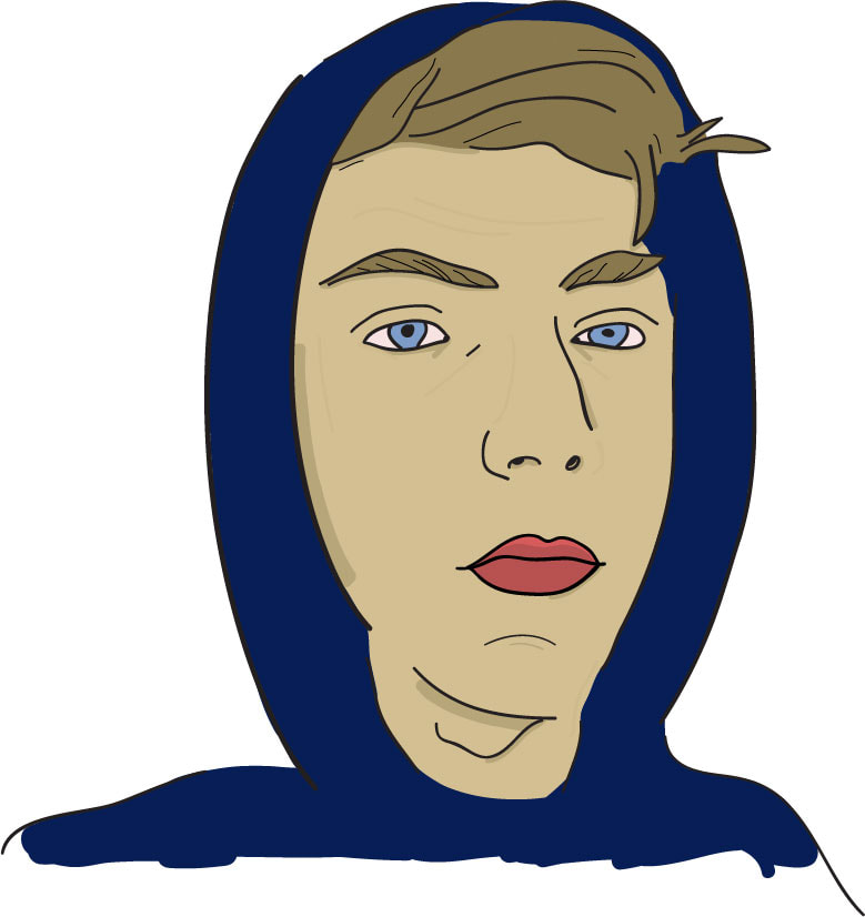
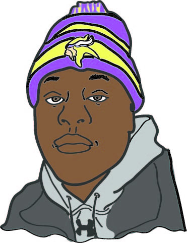
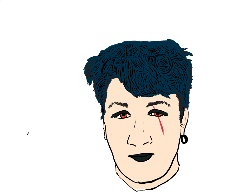
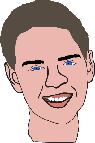
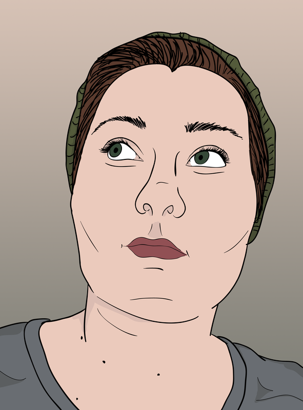
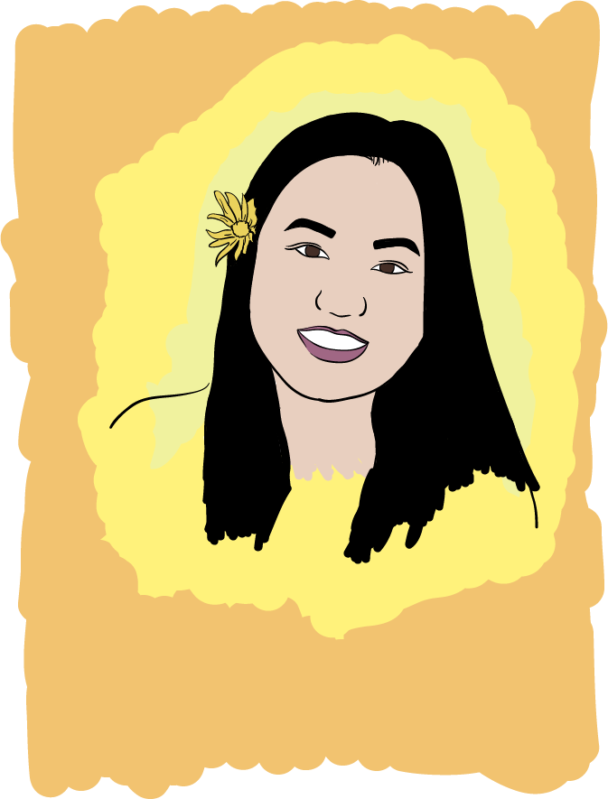
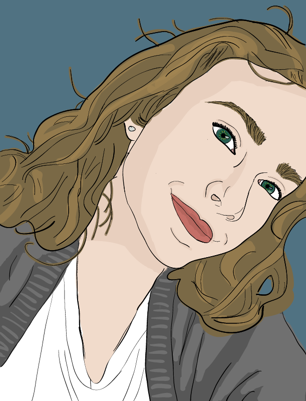
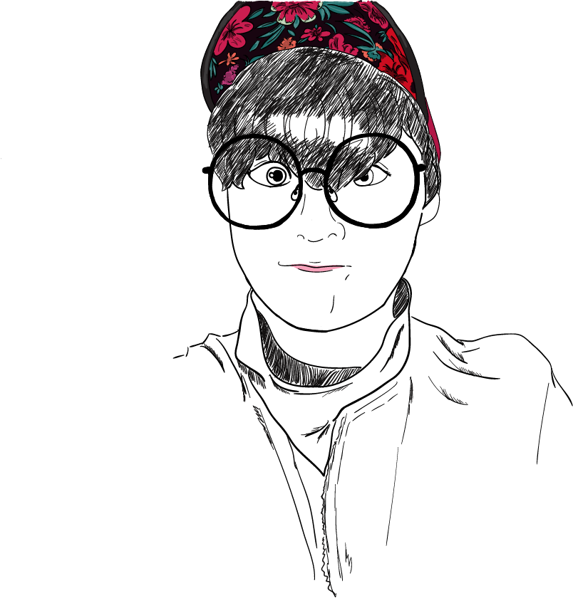
I started my graphic design 1 students on Adobe Photoshop CS6 standard version first. Eventually we started to move into Adobe Illustrator and this is a fun lesson to teach students the basics of Illustrator. Since Photoshop and Illustrator are very different programs, I informed my students ahead of time that this would be a another learning curve-- that some students might catch on quickly, while others might need more practice. Last year, I won a $4000 grant to purchase tech for our graphic design program from the Centurylink Grant award program. I purchased 36 small Wacom drawing tablets for students to use and I instructed my graphic design 2 students to use them for this illustrator sefie project. First, students took a selfie using their phone or one of my classroom cameras. I instructed students that their face had to be showing, but the artistic style, color, line quality, was up to them. I also told students they could change their selfie to an "alter-ego" which made for some very interesting changes to their actual look. This tutorial below by RiceGum on Youtube is both entertaining and informative & we watched the video as a class and then I posted it to the graphic design 2 google classroom for students to reference. When I first taught this lesson, I was worried that it would be too "tracey" and boring for my more advanced students, but it ended up being really okay! Since I allowed students much creative freedom, they were able to really have fun with it. I even had a girl turn herself into a werewolf! After everyone was finished, I created a simple google slides slideshow of each student's selfie to share with the class and I plan on sharing them with future graphic design classes. It was fun having the students guess who each person was! Check out additional examples of graphic design 2 students illustrator selfies below:
0 Comments
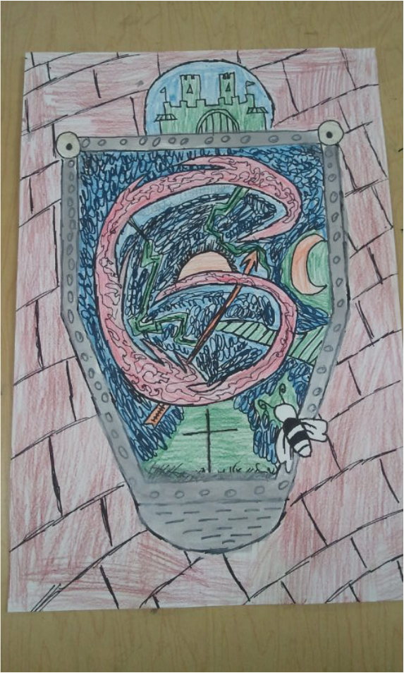
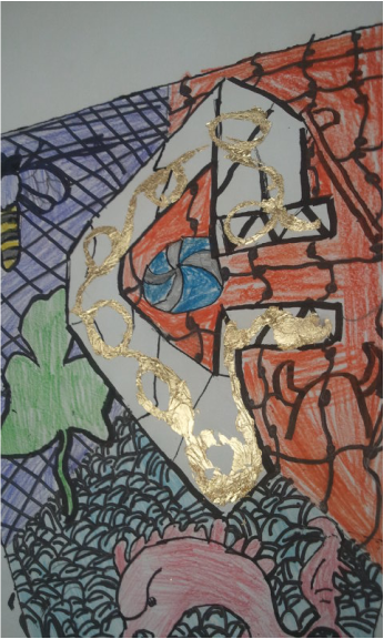
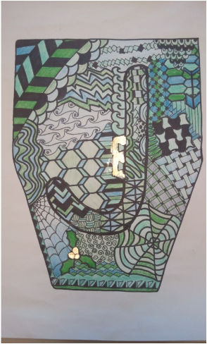
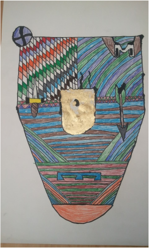
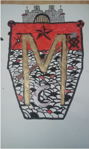
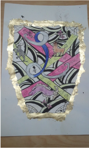
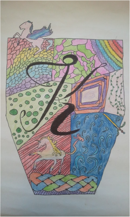 What a crazy project, but so much fun! The last project for my 6th graders involved creating a medieval art inspired coat of arms. We talked about illuminated letters, heraldry symbols, and characteristics of Medieval art. The kids really seemed to like this project. We focused on lines and patterns to create an interesting background for our coat of arms. Students were asked to add a letter to their coat of arms. Some students chose graffiti style letters, while others went the more traditional route. We started running out of time, so not all students got to color in their coat of arms. But even black and white looked cool! I had a huge pack of gold leaf laying in my craft room and allowed some students to add the gold leaf. It was pretty tricky (next time I would use a gold paint pen instead) but the kids were amazed. They were convinced the gold leaf would make their artwork very valuable. ;)
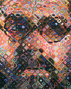 The end of this semester has proved to be quite busy. We are currently working on our birchbark boxes and will hopefully be finished by the end of this week. I will be moving schools for the second semester and that means an entirely new group of students. It also means that I am working on planning the curriculum for this second semester. As an artist who likes to work in a variety of mediums, I am definitely one who likes to try new things and experiment with different lesson plans. A few of the projects we did last semester (pop bottle drawings and zentangle pyramids) will be repeated but I will be teaching many new projects this second semester. One project I have been dying to have students try is a large-scale collaborative grid drawing. I think I will be doing this project instead of the Chihuly sculptures with this group of students. I took inspiration for the grid drawing lesson from Chuck Close's gridded portraits. This lesson is still in the works, but I think it will be a great lesson on drawing what we SEE, rather than what we think we see. This is something I know a lot of 6th grade students struggle with and breaking it down into 5"x5" square chunks should ease frustration. The 7th & 8th graders do their own personal grid drawings and this should be a nice precursor for building up background knowledge of grid drawing. I chose six artists and their portraits for this lesson. I copied and pasted their images into a word document and overlayed a 7"x9" grid over each image. I applied the artistic filter "pencil sketch" over each image to show contour lines more effectively. The Artists:
The hardest part was narrowing my choices down to six artists. These may not have been your own choices, but my criteria for selecting artists was based on the lessons I will be teaching throughout the semester and I wanted to represent different cultures and show a balance of both men and women artists. I plan on printing each gridded artist image twice. I will use my paper cutter to cut out each small 1"x1" square from the image. I will then label the back of each square with a number so we can keep track of which image goes where. Then I will give students a handout for the project with a 5"x5" square box to draw in. Each student gets a small 1"x1" square and will be asked to transfer the 1" box into the 5" box on the handout. I plan on showing students examples of what we are doing, but not what our final image will be. I like a little mystery! :) Once students have their drawing in pencil finished, I'll have them color with markers or colored pencils. I will be testing this project out myself to see how it works before teaching it. The worst case scenario is that it doesn't turn out to look like a portrait. Each final work will be a combination of two art classes (approx. 30 students in each class). The final work will be 35"x45" in size with a total of 63 5"x5" squares in each work. Time required: 2 (50 min.) class periods You can see the document I created with the six artist images below. I will keep you posted about how this project works out!
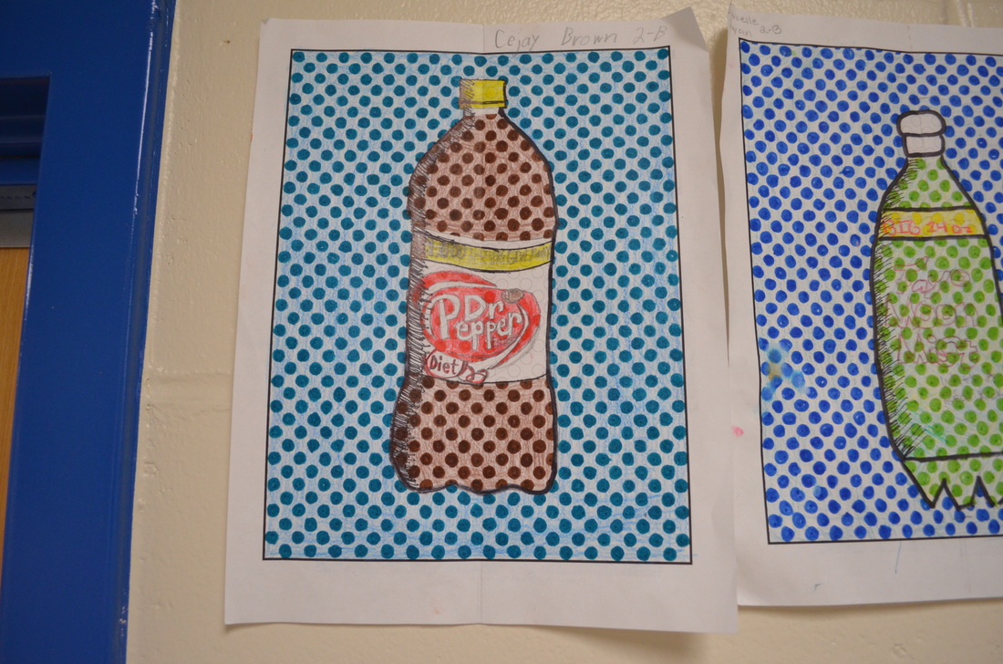
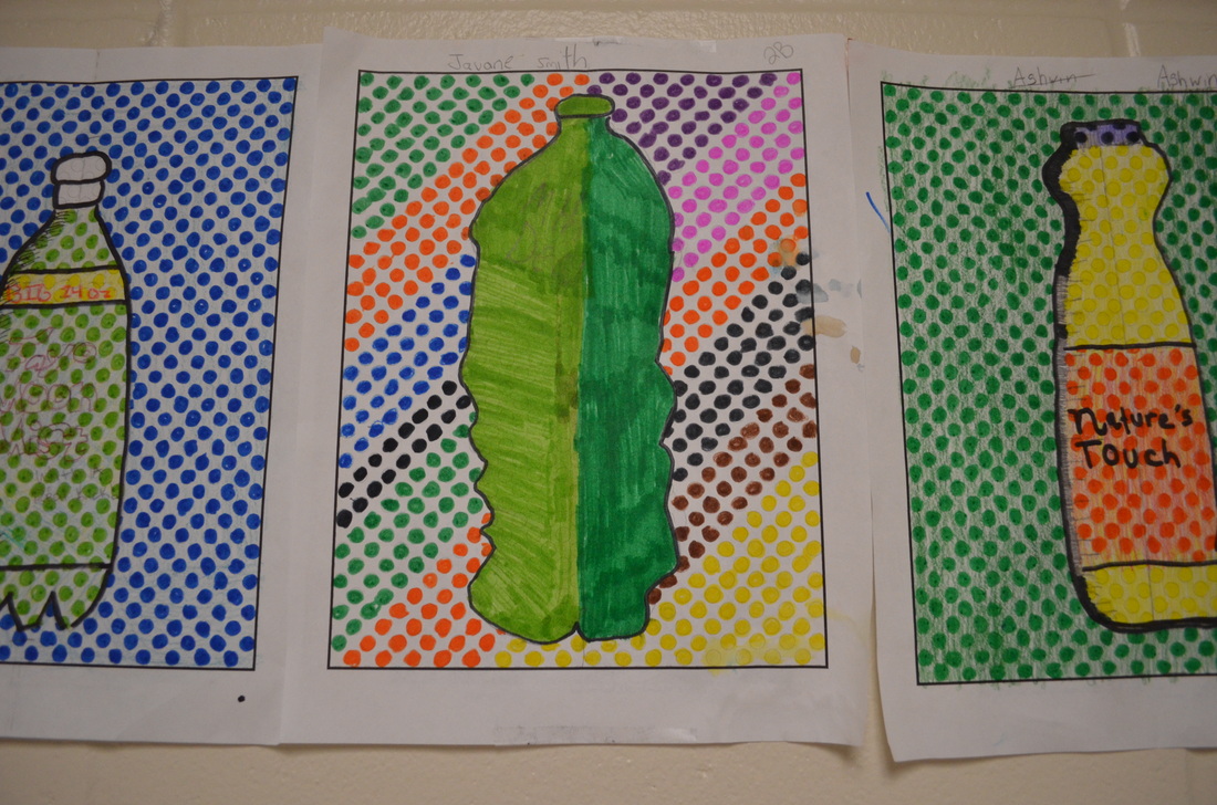
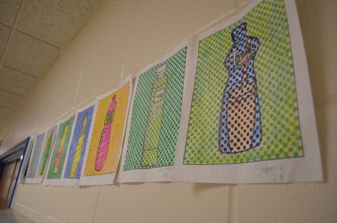
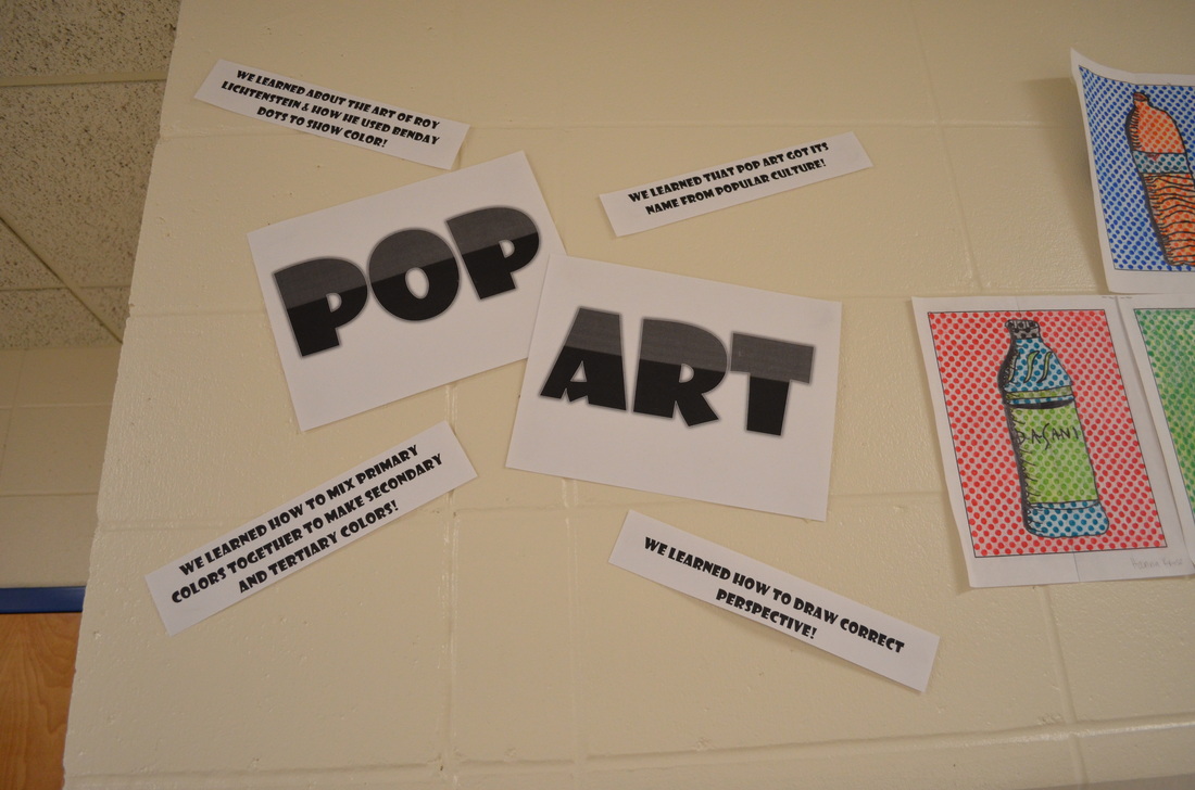
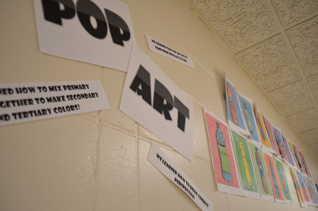
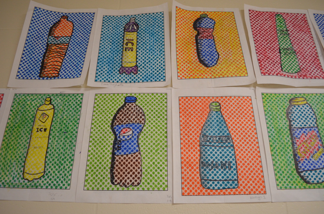 This was a project where students really impressed me. We had been collecting plastic bottles all semester long and so we had about 350 bottles stored in bags and boxes around the classroom. I knew I wanted to teach students how to draw perspective, but I was struggling on what. Then it donned on me-- plastic bottles! Each student chose a bottle to draw. We spent a whole class day talking about pop art and how pop art got it's name from popular culture. We also talked about how artists draw in perspective. They draw what they SEE, and not what they THINK they see. We also talked about how benday dots are kind of like pixels and how they create color when put close together (from far away, they look colored in....up close, they look like just dots). We also learned about creating value and how we could use hatching to show value in our bottles. I showed students comic book drawings that had hatching and this really had them motivated. Download the benday dots handouts!I have my benday dot handouts available in small dots and large dots at my TPT store We looked at several different pop artists including Andy Warhol, Robert Rauschenburg, and Claus Oldenburg....students kept saying that if you're a famous pop artist, you have to have a cool last name. ;) Step One Students practice drawing their bottle. I had students fold their benday dot handouts in half and try to draw only one half of the bottle on one side of the folded line. This helped students get the symmetry right. Step Two They drew the other side of their bottle to match the opposite side. Students had to check the top and bottle of their bottles to make sure they were curved and showing correct perspective. Step Three Students draw the details of their bottle-- logos, fluid ounces, slogans, designs, etc. Students then added their hatching lines to make value. Step Four Students colored in their whole picture LIGHTLY with colored pencils. Students were required to mix the primary colors of colored pencils at least once in their drawing. If students had black on their bottle, I encouraged students to choose another color, as it covers up their benday dots so you can't see them. Step Five Next, students started coloring in the benday dots with markers. This was the most time-consuming part of the lesson. Some students got really impatient, but I had them take breaks to stretch and read some art books if they needed it. Students then outlined all their pencil lines in sharpie to really make it pop. Overall, once they were finished, students really seemed to like their work. When hung up together, they definitely have a "pop" art vibe! 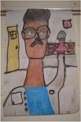 This lesson focused on the artist Modigliani, Expressionism, and Proportions of the face. Students used 12"x18" 60# paper (but 80# would have been better...), oil pastels, and baby oil to create their own "oil paintings". First, I showed students some of Modigliani's artwork. A big question was, "Why did he make all his portraits have long necks?" This led into a discussion about expressionism and how not all art is realistic. Next, we talked about what a portrait is and how we draw correct proportions. I used Expressive Monkey's proportions handout to keep students on track. We folded out papers in half and then each side folded towards the middle. This made three folds. The top fold was the "eye" line. The middle fold was the "chin" line and the bottom line was the "shoulder" line. This made the necks long like Modigliani's.
Students were then asked to brainstorm what they wanted to do when they grow up. If students were stuck, I had them choose something they'd like to do when they grow up (like climb Mount Everest, play in the NBA, go skydiving, etc.) I had them draw three symbols that represented what they wanted to be or what they wanted to do. I modeled this for them by pretending I wanted to be a nurse. I drew a stethoscope, the red cross symbol, and a wheelchair. I told students that I wanted to be able to tell instantly what they wanted to be. Students spent two class periods drawing their self-portrait in pencil first. Then they started coloring in with oil pastel. I had small cups of baby oil spread out over each table. I made sure to only put a little bit in each cup to keep kids from using too much or spilling too much. Students used their fingers and q-tips to blend the baby oil and oil pastel together. Some students really didn't like the smell of baby oil while others had no complaints. We made sure to use newspaper below the portraits. As baby oil was added, the paper tended to turn transparent and there was baby oil everywhere. However, I noticed that after a month of these drying out in the hallway, that the oil seemed to evaporate. I used approximately 6 bottles of baby oil for 250 6th graders. It was more oil than I expected! I bought a pack of 500 q-tips at the Dollar Tree. I had a huge stash of old oil pastels that worked wonderfully though. The dried out oil pastels came right back to life when baby oil was added. I told students to use black last, as black is very tough to cover up and it gets smudges all over! Storing the portraits was a bit of a challenge. Some students used a bit too much oil, so their colors would rub off on other students' work. Next time I would monitor better how much oil the students used. As I stated before though, after a month of drying, they were much less oily. Overall this was a fun project and really helped me get to know my students better! Overall cost of the project was about $25 without the cost of paper for 250 6th graders. 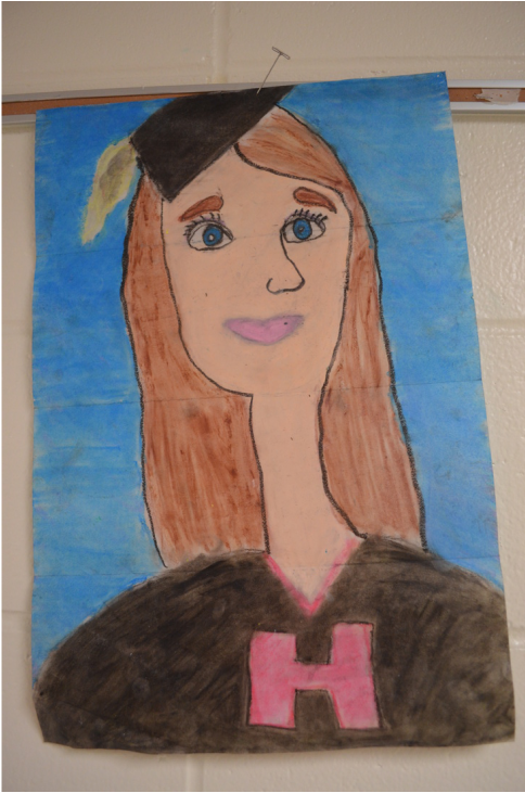 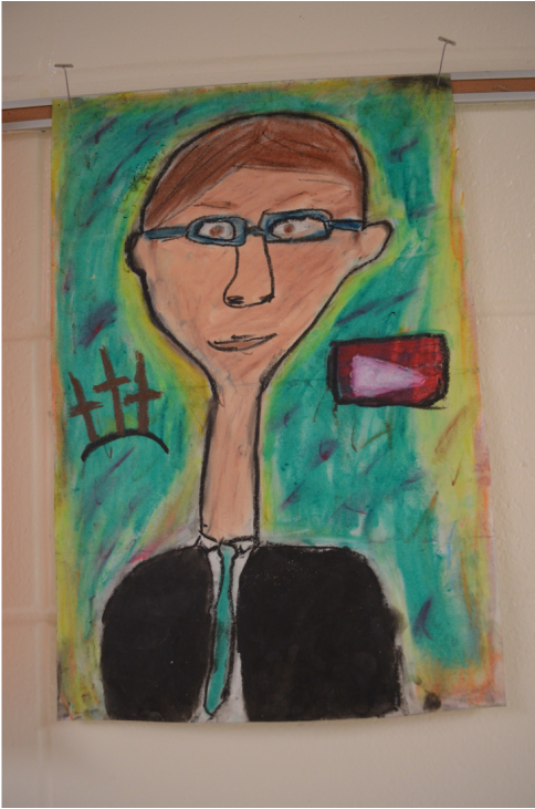 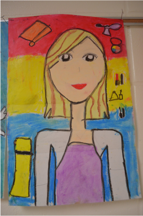 |
Mrs. QuamThis is my 11th year teaching art & graphic design! I have taught middle school for 2 years and high school for almost 5 years. I truly enjoy working with students on a daily basis. I also enjoy teaching real-world skills such as problem solving, using technology, and the power of teamwork and collaboration. My joy is sharing my passion for art with others! Archives
March 2024
Categories
All
|
||||||||

 RSS Feed
Photo from Rob Qld
